The gray, neutral colors of a Winter's sky.
When the cold gray skies of winter replace the bright blue skies of recent and the vibrant colors of fall have departed. We are left with colorless, dull, and lifeless surroundings.
Are you feeling depressed yet? An unfortunate result to the colorless mark of winter can be a feeling of sorrow, depression, or in the case of Robert Frost’s “Stopping by Woods on a Snowy Evening,” represents death, or dying. If it were not for the holiday ornaments in abundance, we would all have a very long winter, sans color.
The skies they were ashen and sober
– Edgar Allan Poe
This time of year, the cold drab colors represented by gray (neutral), blue (cold), brown (lifeless) bring on these emotions. The lighter side of black, gray is a cold color, almost always associated with storm clouds or cold steel and blue can be associated with cold temperatures or ice. I think when people say: Are you feeling blue? or “the blues got you down?” I think it would be more appropriate to say, “the grays got you down?”
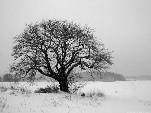
Don’t get me wrong, as an artist and photographer, there are many aspects of winter that are simply beautiful in their own unique way. There are many paintings and photographs of a city scene or country road after a snowstorm that are real works of art. A leafless tree, standing alone against a winter sky, can be as breathtaking as any.

A nice black and white photograph of a lone tree in winter.
Or, for the avid black and white photography enthusiasts, myself included, there is such a genuine and honest way that these two contrasting colors can produce such pure and elegant images. These two colors or color, depending on your view of colors when it comes to black and white (scientists and artists have different views on this subject), are most used for dramatic effect, use of light and the subject at hand.

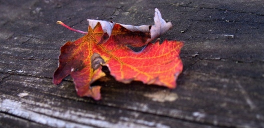
A bright orange leaf in contrast to the weathered wood of a picnic table.

By adding contrasting colors, this red wreath against a gray door, makes for a real focal point.
HINT OF COLOR – I also like images, whether they are black and white photography, paintings, graphic design, or any medium for that matter, which use black and white as the main color, but is then enhanced or accentuated with just a hint of color. I find that the small amount of color can make a real difference and can create an interesting focal point. Why do you think a colorful wreath on the door during the holidays looks so good? Or a gray house with its door painted red looks so inviting. It’s that vibrant accent color that makes all the difference.
~
So, after the holidays have passed and all the color has disappeared from your home, you won’t feel, well…..gray, bring in more color during the next few months. Use bright, vibrant artwork on the walls, colorful pillows on the couch, accent rugs and the like. Or, if you are more adventurous and willing to have a more permanent feel, try painting one wall with a very uplifting accent color.

Use colorful graphic artwork over a couch to enhance mood.

Colors are added to this room by the addition of pillows and a designer rug.

A brightly painted wall adds warmth and artistic character to any room.

Change out artwork throughout the season. Use bright orange and red pieces to brighten a room.

A bright orange accent wall and orange artwork add a distinctive look and feel to this room.
 Pantone recently released its newest color for 2012 | Tangerine Tango


